6 Powerful Tips to Build A High Converting Newsletter Landing Page
In today’s digital world, an email newsletter can be the key to owning your audience. With a high-converting newsletter landing page, you…


In today’s digital world, an email newsletter can be the key to owning your audience. With a high-converting newsletter landing page, you can make your quest much easier.
It doesn’t matter whether you’re an individual creator, small-business owner, or the media head of a multi-million dollar company. If you have a newsletter, you have a way to directly communicate with your readers by sending your message directly to their email inboxes. Thus, you become algorithm-proof.
With a newsletter, you can provide consistent value to your readers. This helps you nurture healthy and long-lasting relationships with them.
A high-converting landing page makes building a newsletter 10X easier.
For the uninitiated, a landing page is the first thing readers see when they click on your “Sign up for my newsletter” link.
Usually, landing pages offer something of value (i.e. weekly updates, tips, tricks, industry secrets — or whatever your newsletter is about) in exchange for the reader’s email address. The purpose of a landing page is to convert casual visitors into subscribers.
The concept of a landing page might sound simple, but it’s not always easy to create a powerful page with a high conversion rate.
In this post, I’ve analyzed some of the internet’s best newsletters and compiled a list of six elements you can add to your landing page to make it highly converting and successful.
Before we get started, let’s answer an important question first.
Why is it important to have a good landing page for your newsletter?
A high-converting newsletter landing page has the following incredible benefits:
- Landing pages build brand legitimacy: A good landing page creates legitimacy and solidifies your newsletter’s brand.
- Use landing pages to showcase extras: Build and nurture a place where you can include extra information (social media pages, free, and paid products or services you’ve created, credentials and your past achievements, etc.) for your readers.
- Include calls to action on your landing page: You can add calls-to-action for multiple user types, thus making your sales funnel more visible.
- Grow your audience with your newsletter landing page: With a high-converting newsletter landing page, you can convert more casual passers-by into newsletter subscribers.
- Make connections: You can subtly lay out your vision on your landing page, and connect with potential collaborators and clients.
- Attract sponsors with a smartly-designed landing page: Attract high-quality advertisers to set up sponsored newsletter collaborations for your email list.
Excited about creating a high converting landing page for your newsletter?
Let’s dive deep into the six ways you can amp up your landing page and welcome more email subscribers. Each tip is followed by a bonus tip to improve your conversion and turn casual visitors into lifelong supporters.
1. Tell Users Exactly What to Expect on Your Newsletter Landing Page
Make sure the reader knows exactly what to expect when they join your newsletter.
A user’s email inbox is a private place. Imagine how uncomfortable you’d be feeling if a stranger looked at your screen while you read through your emails every morning.
If that thought made you shudder, you’ll understand why inboxes are highly personal and appreciate how wary people are about giving their emails away to just about anyone on the internet.
To make sure you deserve entry into a user’s inbox, your newsletter landing page has to be honest with them about the following:
- Content: What’s going to be included in your emails
- Frequency: How frequently can they expect to see your name in their inbox (aka, your newsletter publishing frequency)
- Perks: Any other subscriber-only perk that might be included.
An example is the CoffeeCup Newsletter’s landing page. As you can see, the page is easy to read, navigate, and answers all the questions a user might have before they hand in their email.
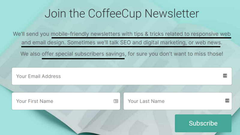
Bonus tip: Create a sense of FOMO through your newsletter landing page
The internet (and to be honest, most offline businesses) run on FOMO or the fear of missing out. When you make it clear what people stand to lose if they don’t subscribe to your newsletter, you’ll automatically improve conversion.
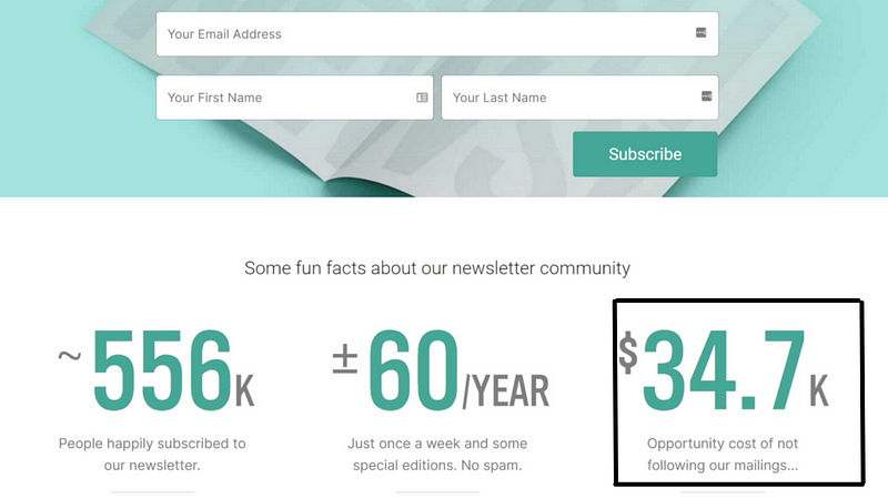
The CoffeeCup newsletter does it in two ways (which you can emulate as well):
- Telling people how many existing subscribers the newsletter has, thus showing it’s trusted by so many people and is truly valuable.
- Mentioning an “opportunity cost,” or how a user might end up losing money if they don’t subscribe. This is especially applicable if you sell something and offer discounts to your subscribers. But if you’re creative enough, you’ll find a way to create FOMO even when you’re not selling anything directly.
2. Remove Distractions From Your Newsletter Landing Page
Remember what we covered at the beginning of this article? A landing page’s main purpose is to convince people you’re worthy of communicating with them.
You don’t need extensive design or too many elements on your page to make this happen. A good landing page has the following in common:
- It’s bright
- Easy to read
- There is a clear CTA
The key here is to always keep your goal in mind, i.e., you need as many people to leave their email addresses as possible. For that, you don’t need extensive design elements. You just need your CTA to be visible.
Here’s an example from the BrainPint newsletter landing page. As you can see, there are no distraction links or articles that might divert the traffic elsewhere. The only thing that catches attention is the bright “Subscribe” button — a very effective tactic indeed.
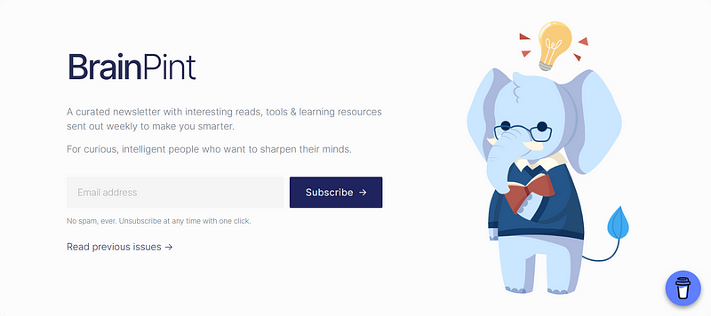
Bonus tip: Build brand identity with your newsletter landing page
With a simple newsletter landing page design, you can showcase your brand logo and colors to the users. If you stick to the same color scheme and aesthetics while sending your newsletter or making social media posts, you can ingrain it in the brains of your most loyal supporters that these colors belong to you.
This way, they’ll remember you whenever they see the same color combinations, thus making your brand recall value 100x more powerful.
3. Be Transparent With A Newsletter Archive on your Newsletter Landing Page
There’s a common concept in marketing of “try before you buy.” Industries like clothing or food put this into direct practice with astonishing success rates.
As a newsletter writer, you can do it by offering readers a glimpse at your previous newsletter issues. This way, users get to peruse through your archive and decide for themselves if they want to be involved with what you create.
This might sound counter-intuitive as it will deter some people, but as a newsletter writer, transparency can be your most underrated superpower. You’ll only draw people who are more aligned to your vision and goals, thus building a powerful and dedicated community of newsletter subscribers.
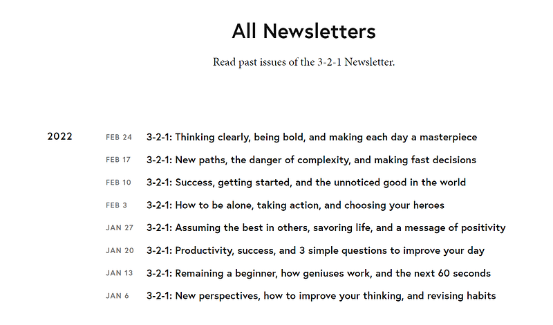
Author James Clear does a great job of this by letting the users read through his most recently-published newsletters by scrolling towards the bottom of the landing page for this 3–2–1 newsletter.
This builds trust and makes the user more likely to subscribe if they know you deliver on your promise of sticking to a publishing frequency and delivering value with each newsletter issue.
Bonus tip: Build an online portfolio with your newsletter landing page
When you showcase your newsletter archive so publicly on your landing page, it immediately creates an online portfolio for you. You can use this to pitch to potential clients, customers, or advertisers, as they can directly navigate through the links, read a few issues, and make their decision.
Having your most powerful work on a single page is an underrated strategy only a few creators think of. If you apply this to your newsletter landing page, you’ll automatically be ahead of your competition.
4. Be Creative With Your Headline on Your Newsletter Landing Page
The headline text is the first thing your visitors read after they arrive on your landing page. After that, they’ll most likely read the subtext below it. Be creative with the copy and add your personality to capture your visitor’s attention.
Some important points to write an interesting headline:
- Length: Make sure it’s 5–7 words long and cuts directly to the point.
- Think big! Think out of the box instead of just summarizing your newsletter’s value.
- Sell a vision: Appeal to the user’s emotion or sense of judgment so they’re more likely to click on the “Sign up” button.
- Be yourself 🤪 Throw in your personality and be as quirky or humorous as you’d like to be.
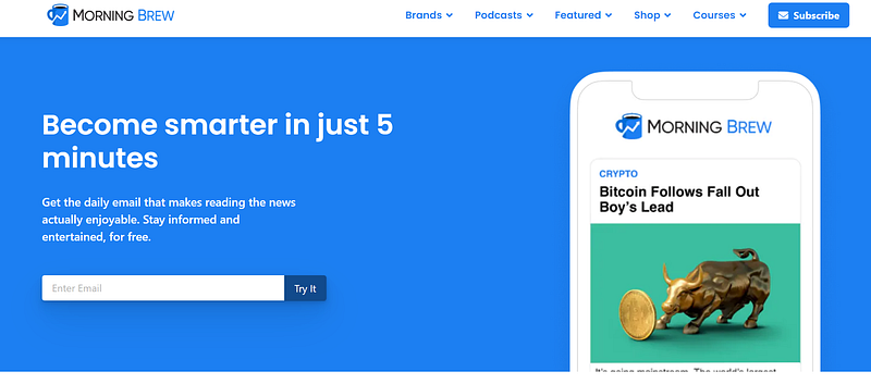
For example, Morning Brew is a daily newsletter that shares a round-up of news items from all over the world. The landing page claims “Become smarter in just 5 minutes.”
It could have said “Read curated news items from all over the world every morning in your inbox,” but that’s long and uninspiring.
The claim of getting smart in just 5 minutes is way too tempting for any casual user to ignore and thus serves as an incredible example of creative headline copy for a newsletter landing page.
Bonus tip: Boost brand value with a creative tagline on your newsletter landing page
As your brand grows and more and more people subscribe to your newsletter, the headline you use on your landing page could very well become the tagline for your business.
5. Offer Something for Free, aka a “Lead Magnet” on your Newsletter Landing Page
According to Investopedia, a lead magnet, also called an “opt-in bribe,” is a marketing term for a free item or service that is given away for the purpose of gathering contact details.
Having a lead magnet on your landing page can be a powerful way of getting more email subscribers. After all, the promise that they’ll get instant access to a valuable item just by providing their email address is a powerful emotional trigger to convert visitors.
You can find some creative examples of what products or services to offer as lead magnets (with examples) here.
Nicolas Scalice, the author of Growth Marketer, offers free guides to marketers as a welcome gift to every new email subscriber who joins. This can be a powerful way to build trust and create a sense of FOMO while making sure the user gets some actual immediate value in exchange for their email.
Bonus tip: Increase the perceived value of your newsletter
Showcasing your lead magnet together with the pointers letting the users know what to expect from your newsletter can be an interesting way to improve the perceived value of your offering.
Readers love bulleted lists, and the more points you have on your list, the higher your conversion rates will be.
6. Add A Ton of Social Proof on Your Newsletter Landing Page
People love buying products or being part of communities when they know it has worked for other people before, and thus, there’s a high chance that it will work for them as well.
You can bring this level of trust into your newsletter landing page by adding a ton of social proof. This can be in the form of reader testimonials, screenshots of Instagram stories by readers, or Tweets.
Adding social proof relieves the anxiety some new users might feel about sharing their email addresses with an unfamiliar writer or brand. By including reviews from previous readers on your landing page, new visitors get extra reassurance of your value proposition and will be more inclined to subscribe.
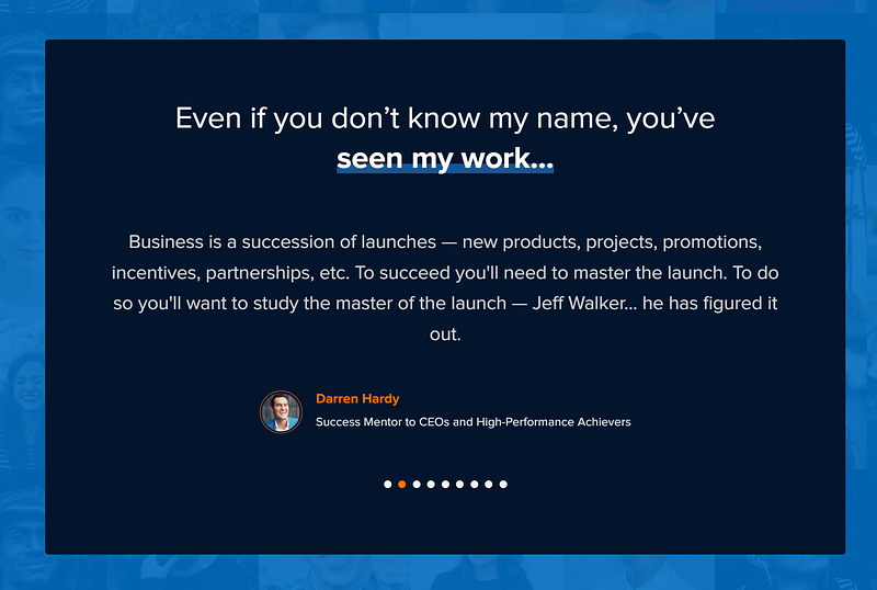
Writer and entrepreneur Jeff Walker does an amazing page of adding a ton of testimonials towards the bottom of his newsletter landing page. This makes him seem instantly credible to new subscribers and makes them more likely to type in their email addresses in the “Sign up today” box.
Bonus tip: Your newsletter landing page could be part of your personal branding effort
By adding testimonials, an archive of your previous newsletter issues, and creative copy dripping with your unique personality, your newsletter landing page can become a strong prong in your personal branding efforts.
Essentially, your landing page might be one of the first things a user sees when they Google your name. So make sure it’s worth the time of every new person who arrives at the page.
A strategically-designed newsletter landing page can convert new users into loyal supporters while reinforcing the value you provide in the minds of existing subscribers.
Summarizing: How to Build A High-Converting Newsletter Landing Page
Whether you’re a solo creator looking to build an empire or an established entrepreneur trying to reach even more clients, an email newsletter is the most powerful asset you can have on this journey.
It helps you build a tribe of loyal supporters by providing them constant value, while also making it easy for you to reach thousands of users at once without having to depend on any social media platform or algorithm. With the right strategies, you can also monetize your newsletter, making it one of the strongest pillars of your passive income goals.
That said, spending some time designing a high-converting landing page for your newsletter can go a long way in increasing your subscriber count while boosting your brand and improving your credibility. Here is the summary of six strategies from some of the internet’s most successful newsletters on how you can design your landing page for more email subscribers:
- Be clear & concise: Tell users exactly what to expect when they join your newsletter.
- Have a goal: Keep your goal in mind and the landing page free of any distractions.
- Strut your stuff: Showcase links to your archive of previously published newsletters so the users can “try before they buy.”
- Be creative with your headline copy to set your newsletter apart and make it easier for the user to believe you’ll be able to provide value.
- Perks help! Offer something for free, aka a lead magnet that users get instant access to the moment they sign up for your email newsletter.
- Prove your value: Offer a ton of social proof on your landing page in the form of testimonials from existing readers or clients, thus convincing new users why it’s worthwhile subscribing to your newsletter.
What other tips have helped you design a high-converting landing page for your email newsletter? Feel free to leave a comment and share your thoughts.